

Matt’s Bar Website Redesign Case Study
Project Overview
Project Name: Matt’s Bar website redesign
Project Description: Redesign the website for Matt’s Bar to make it more modern while keeping the authenticity of the family-friendly bar.
Team Members: Carina Daniluk, Emma Nalezny, Jill Ballandby, Josh Kohanek, Deric Shelstad, Chisaki Miyajima
Tools Used:Figma, FigJam, Google drive, Google Slides, Google Sheets, Google Docs, Trello, Slack, and Zoom
I enjoyed taking on more of a leadership role in this project and setting the team up for success. The first thing I did was set up the Google Drive folders, Trello board, and Figma team. I made sure all requirements were clearly labeled and organized to keep us on track. I also took on a lot of the design elements in the project and collaborated with my team members to get the look and feel we wanted to achieve.
The Problem: Essential details are not easily accessible for first-time visitors due to dense wording and lack of responsiveness
The Solution: Preserve the website’s authenticity while bringing in modern elements and ensuring that all essential details are easily accessible for first-time visitors
Research
I attended the stakeholder interview and took notes. The takeaways from the interview were that the stakeholder helped design the current website and is happy with it. We discovered that in the summer, most of their customers are tourists, however, in the off months it is mostly the regular customers.
I created a Google Forms survey that was not specific to Matt’s Bar, which returned 39 responses. The survey results showed that finding the menu, hours and location, and mobile responsiveness were important to users, so those became the focus of the redesign.
Design research: Between the competitor analysis and the heuristic evaluation I conducted, I found a few more opportunities for change. Matt’s logo and navigation list items are very blurry. The pages are text heavy, and the headers on each page are almost below the fold and very small. Every site I looked at had online ordering, and was also the most popular answer in the survey of what people look for on a restaurant website.
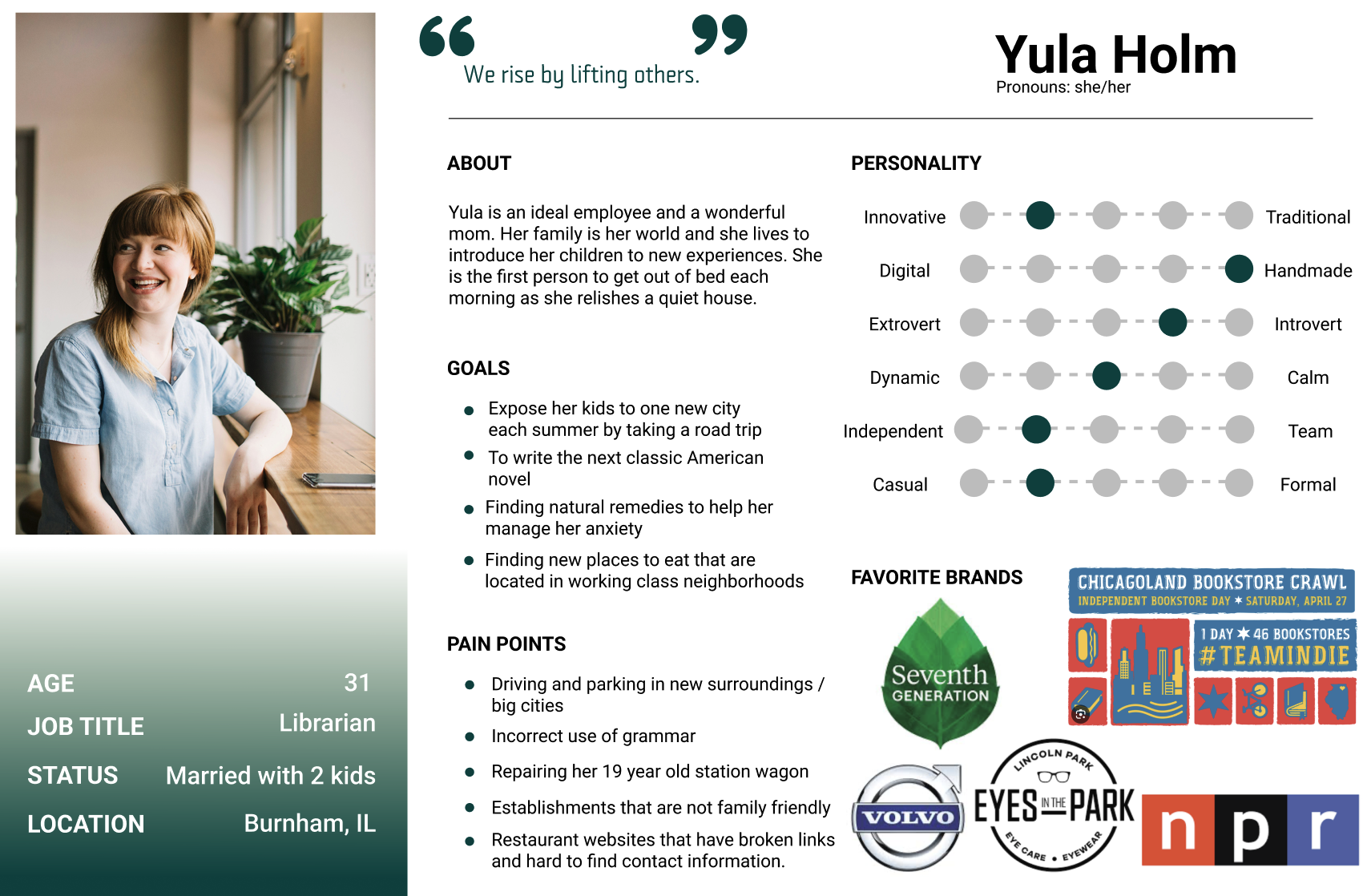
User Persona
This is where the survey results and user testing really shaped the user persona. Yula is a young mother that tries to visit a new city with her family each summer before the kids have to go back to school. She decided they were going to visit Minneapolis and one of her stops would be Matt’s Bar. She was attracted to the celebrities that have all visited and praised the bar, and by the unique experience of the “jucy lucy”. She’s got high anxiety and has to prepare for her trips ahead of time. She is able to find information on the website like the hours, the pricing and the parking.

Sketches and Wireframes
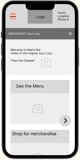
I created the low-fi wireframes for testing. I wanted to shorten the menu a little, move the location and hours to the top and make the menu one of the first large cards on the homepage. I wanted the menu to be accurate and have a hierarchy (the original site had milk listed as the first beverage, when the stakeholder said they sell soda the most - even more than beer!)

A/B testing (low fi)
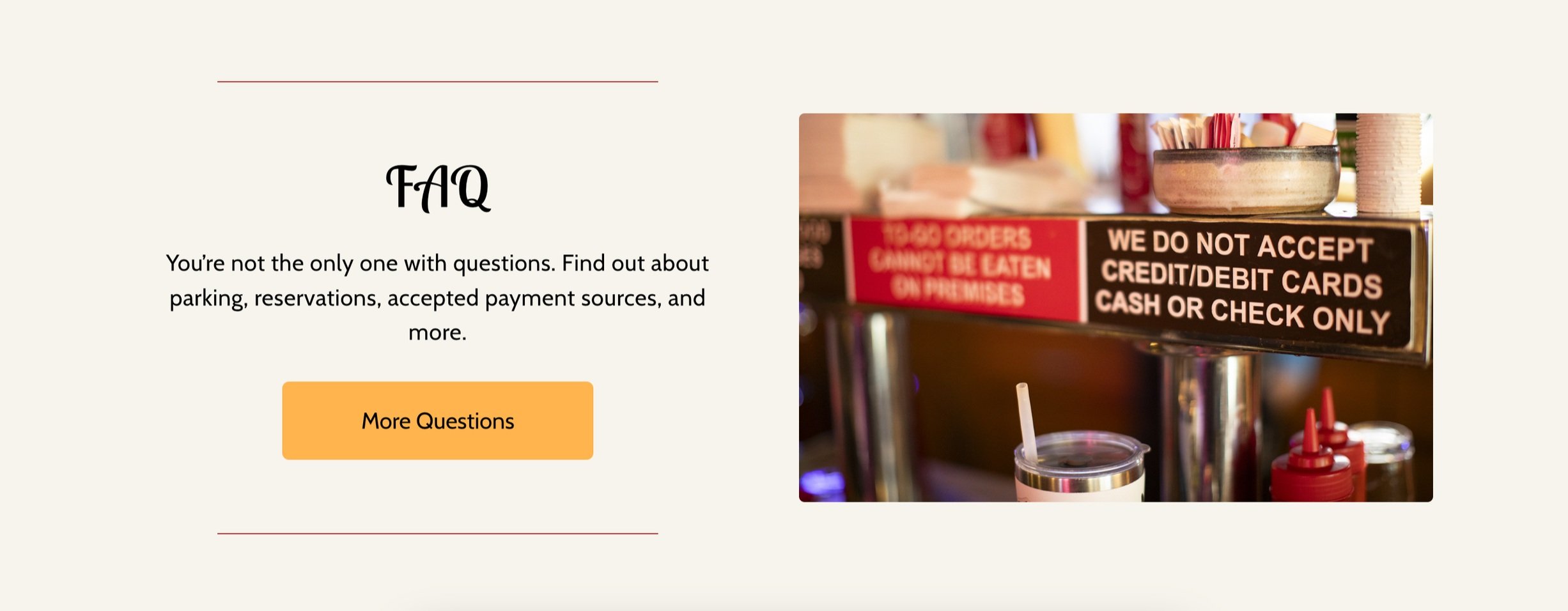
The stakeholder spends a lot of time dealing with issues around being a cash only establishment and requested a way to highlight that on the webpage. Users mostly preferred a pop up to the warning bar in the A/B tests (A). They said pop ups are annoying but because it was important information, they felt it was justified versus an ugly banner that everyone could ignore.
On mobile, users liked the “hamburger” menu I designed. They said they would recognize that as a menu because it was still the 3 lines like a normal menu and thought it was unique.
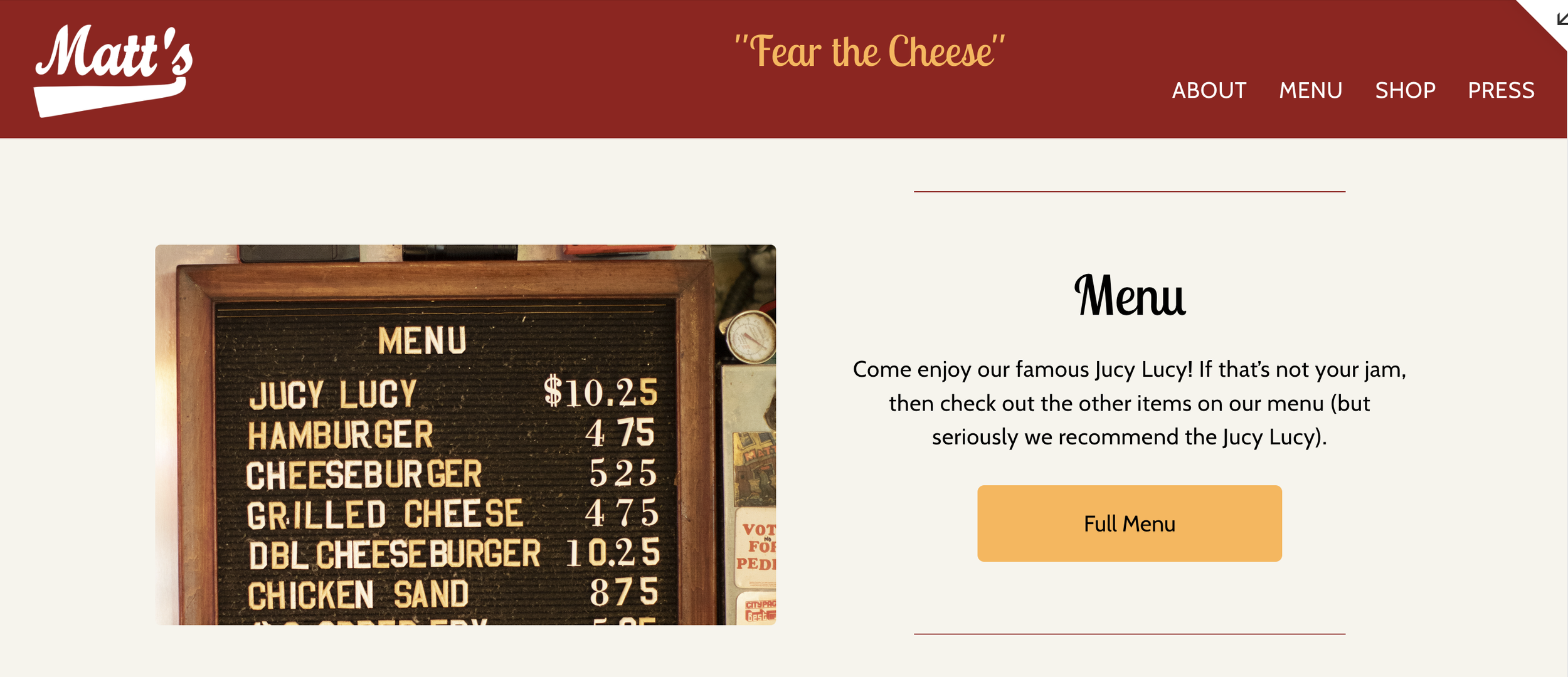
FIGMA High-fidelity Prototype
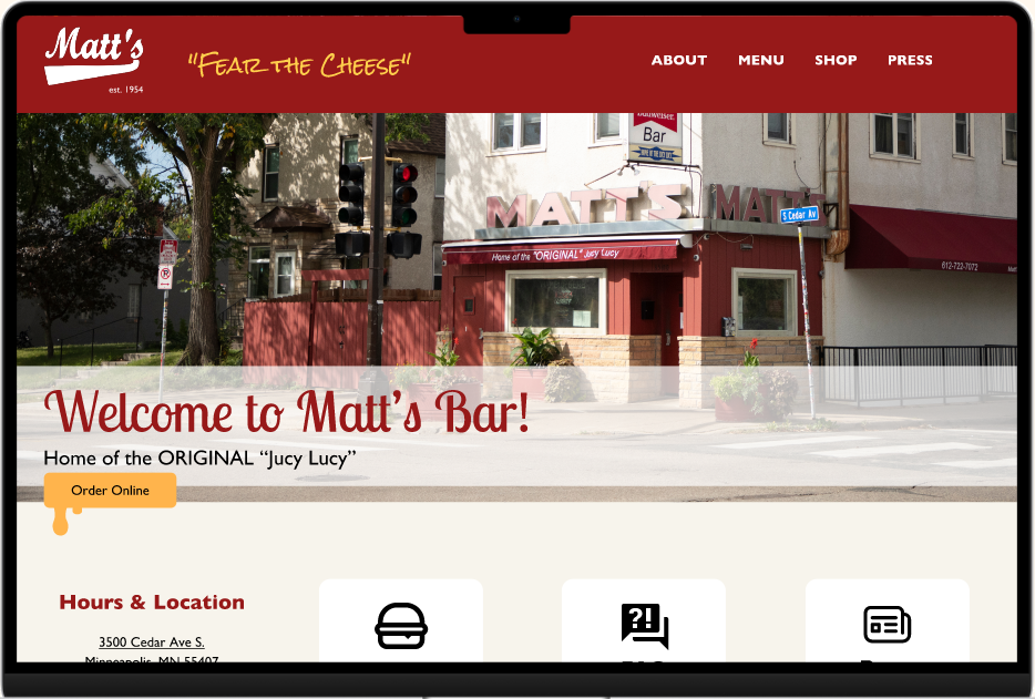
Based on user tests, it was important to keep the red color in the design since it is iconic for Matt’s Bar. The accent color is a warmer yellow-orange to keep it from feeling like fast food franchises, but still represents the cheese of the famous “Jucy Lucy” burger. The hours and location were moved out of the header as it felt cramped and made the header too thick.
Users liked the “Lobster Two” font for the headers instead of the Gill Sans (this is the font used on the original website) because it made the website feel more unique. The cards were formatted in more of a zig-zag pattern down the home page to give it flow and hierarchy. I added some custom CSS as well to make the buttons and navigation items/dropdown hover effects.
Final Prototype
The cards were formatted in more of a zig-zag pattern down the home page to give it flow and hierarchy. I added some custom CSS as well to make the buttons and navigation items/dropdown hover effects.

Summary
There were some limitations with Squarespace. Things like animations would have taken a lot of custom coding, and with the time frame, we had to prioritize. I am proud of how the final design came out, and Squarespace actually made me think differently about the design and consider other options.
I learned to start working with the platform that the website will be live on right away so as to not waste time on things that may be limited by the platform.