
National Weather Service Redesign Case Study

Project Overview
The National Weather Service website is outdated and challenging to navigate. My redesign modernizes the interface, creating a pleasant and effective user experience. This will encourage users to return to the site and benefit from the information it provides.
Role/team: This was an individual project, so I was the UX researcher and UI designer.
Tools: Figma
Client/Date/Duration: This was a 3 week project from start to finish
The Challenge or Problem Statement
The main issue with Weather.gov was its cluttered, text-heavy pages and a confusing, dense navigation system that was difficult to use on mobile devices. The site was not optimized for mobile, so desktop features like hover menus and article scrolling didn’t work on mobile devices, and the small text was hard to read.
Addressing this mobile conversion problem was crucial because an increasing number of users primarily use mobile devices. If users cannot access vital safety information about severe weather or check upcoming weather, they may not be fully prepared and safe.


Conclusion
Test: Validation, Usability, Feedback
Concepts, Sketching, Wireframes
Research & Analysis
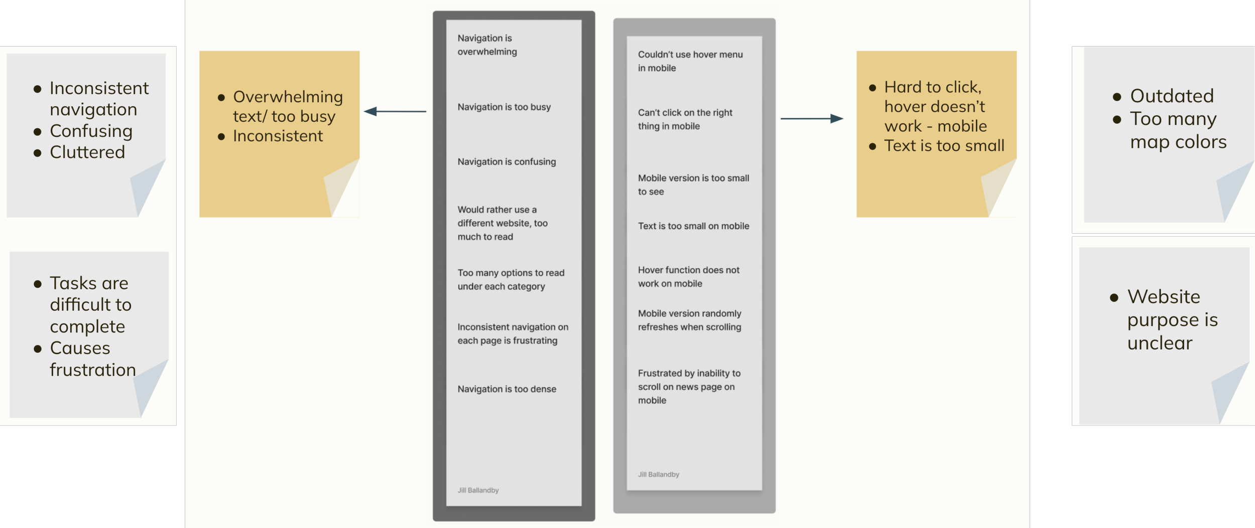
Key takeaways from interviewing users on the current site came down to outdated design, cluttered homepage and confusing navigation. It was important to identify the path the user had to take to get to certain areas of the website and how many clicks it took. To get to basic safety information about driving in a winter storm, it took users 4 steps and a lot of time looking for the right section to click on. 4 out of 5 users could not find what they were asked to find in testing.
Challenges
Navigation Design:
Initially, I planned to use a hamburger menu for the navigation. This design was ideal for including extensive information without cluttering the homepage. However, it also concealed all options, requiring users to search for them. User tests revealed that making options readily accessible without entering a menu was more effective for users to find what they need at a glance. This taught me that user priorities should shape the visual design, even if it deviates from the original idea. This principle is essential for all future projects.
Navigation Contents:
The navigation menu had extensive contents. Due to time constraints, I couldn't incorporate everything from the new site map into the final design, so I prioritized the most important options based on user tests. If I revisit this project, I would include all options. I learned that for future projects, large navigation systems require adequate time to ensure everything is included.
Overall, this challenge involved managing many moving parts as an individual. I appreciated the opportunity to discuss and brainstorm ideas with my fellow classmates. I gained valuable insights into visual design based on user needs and how to implement these effectively. Determining when a project is truly complete can be challenging, but user tests conducted through various iterations helped guide that decision.
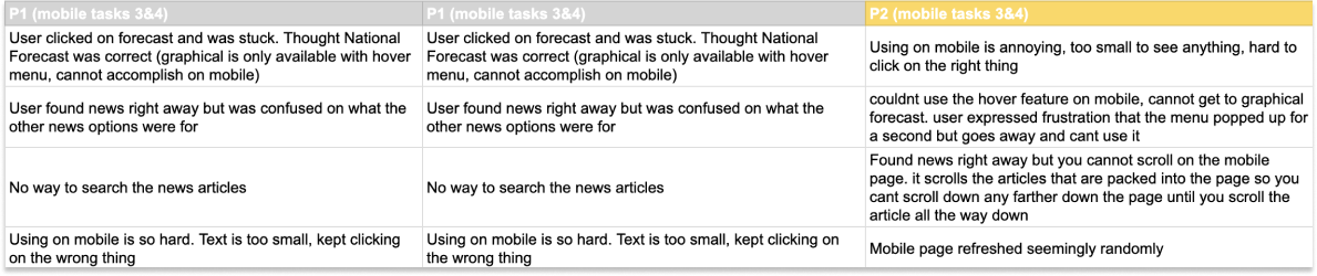
I started with user tests over zoom, having users give their first impressions of the original site and giving them a few tasks to complete. The majority of the users could not complete either task and expressed frustration with the mobile website.
Task: Navigate to graphical forecast
1. Hover over Forecast in navigation bar
2. Select Graphical
Task: Find the newest news articles
1. Hover over the News navigation option
2. Select NWS News
Here are the links to the user testing videos.
Prototype
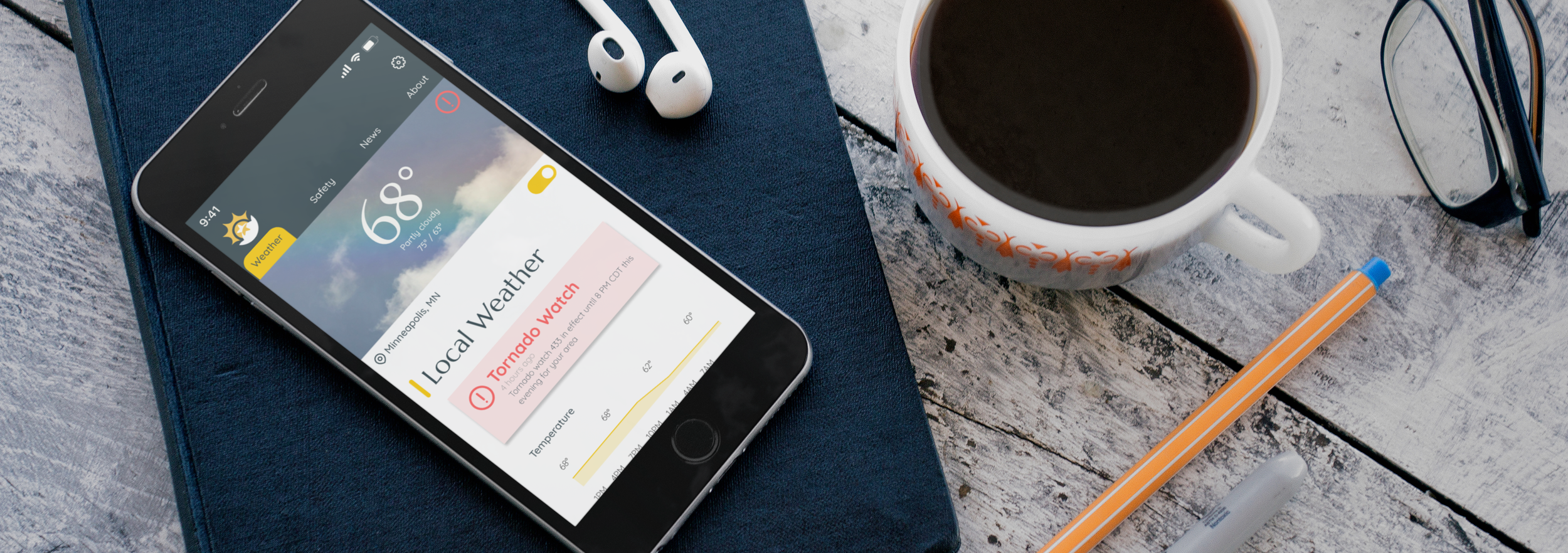
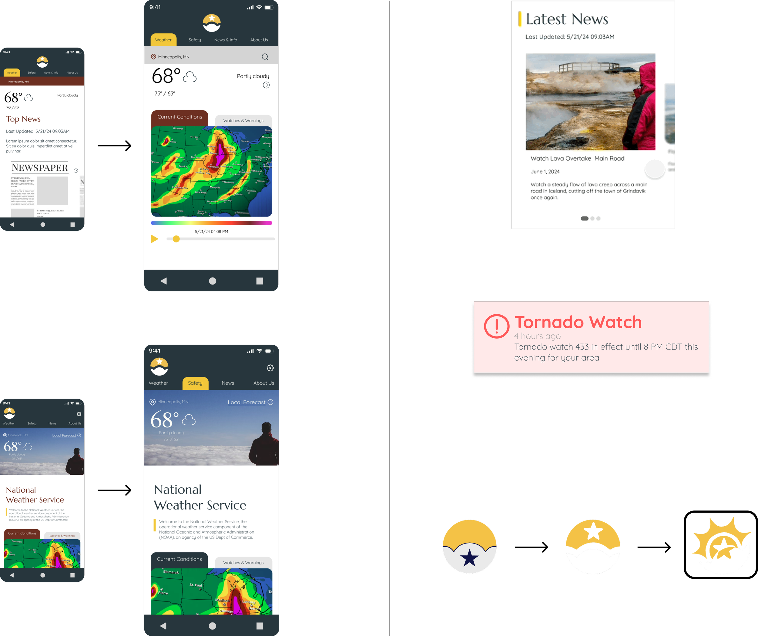
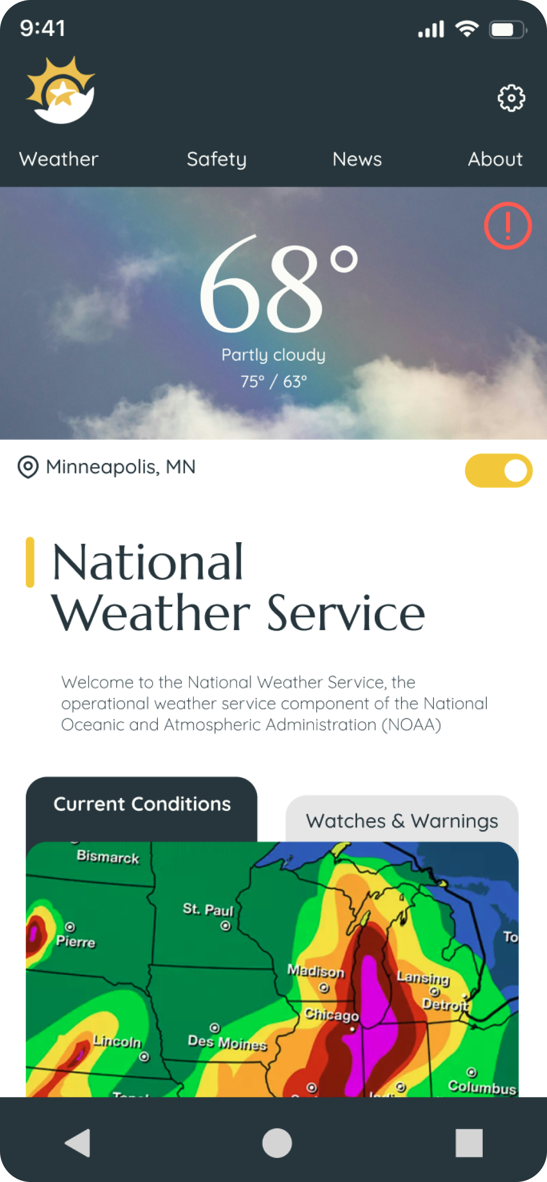
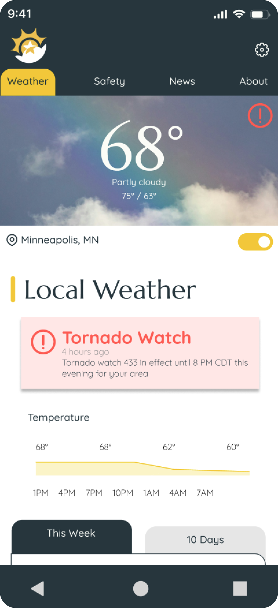
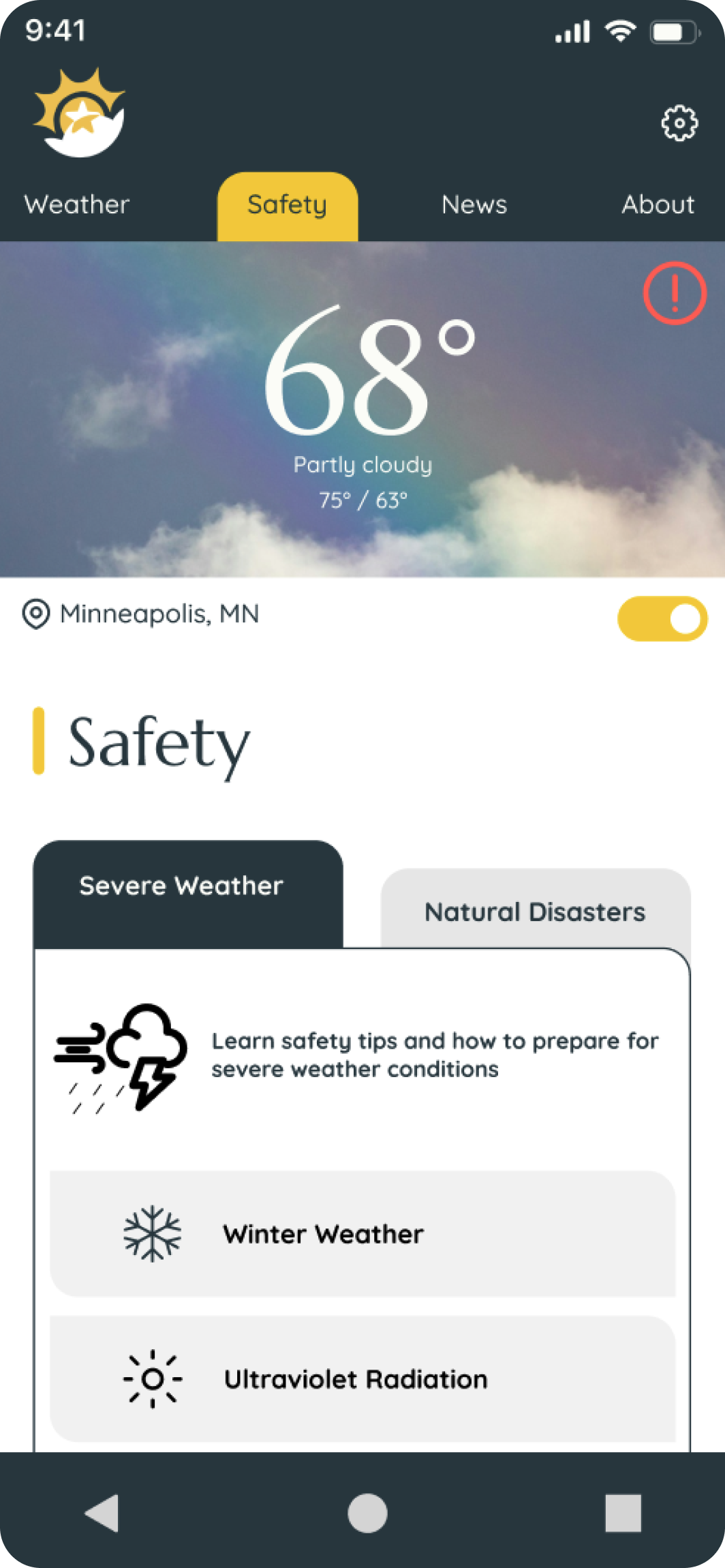
Using a tab system to click around the NWS website on mobile makes for a pleasant experience and easily visible navigation. The location toggle allows for effortless location recognition, and when toggled off, the user can search for any area in the country.
Link to the prototype
Visual Design & Prototype
The National Weather Service is a trusted source of information for users. Cleanliness and simplicity reflect reliability and accuracy while the warm pops of yellow symbolize a sunny day to help the user feel welcome.
I wanted a sans-serif font to maintain readability and clarity, emphasizing the importance of organization and accuracy while the flared serif font grabs users attention for important headlines and reflects a newspaper-like display of information that is dependable and trustworthy.
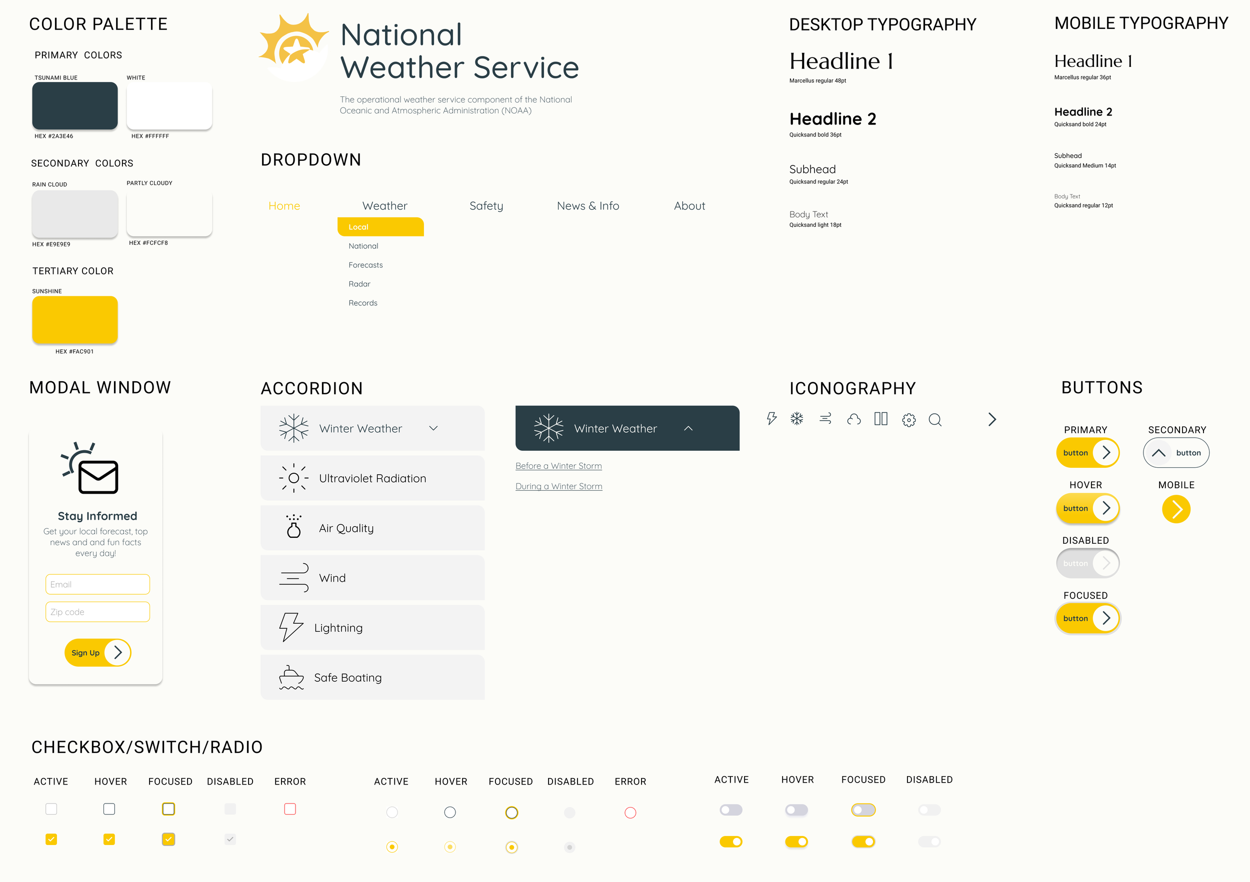
To accommodate users viewing on small screens, I designed an image carousel for the news section with large visuals that are easy to swipe through. I prioritized displaying the most important information and provided users the option to explore further if desired, effectively minimizing unnecessary clutter.
Initially, red was a primary color in the palette, but my research revealed that users preferred red to be reserved exclusively for warnings. Additionally, users favored having the weather displayed at the top, with the news below, as the weather was more important to them. Consequently, I revised the hierarchy from the first draft to better align with user preferences.
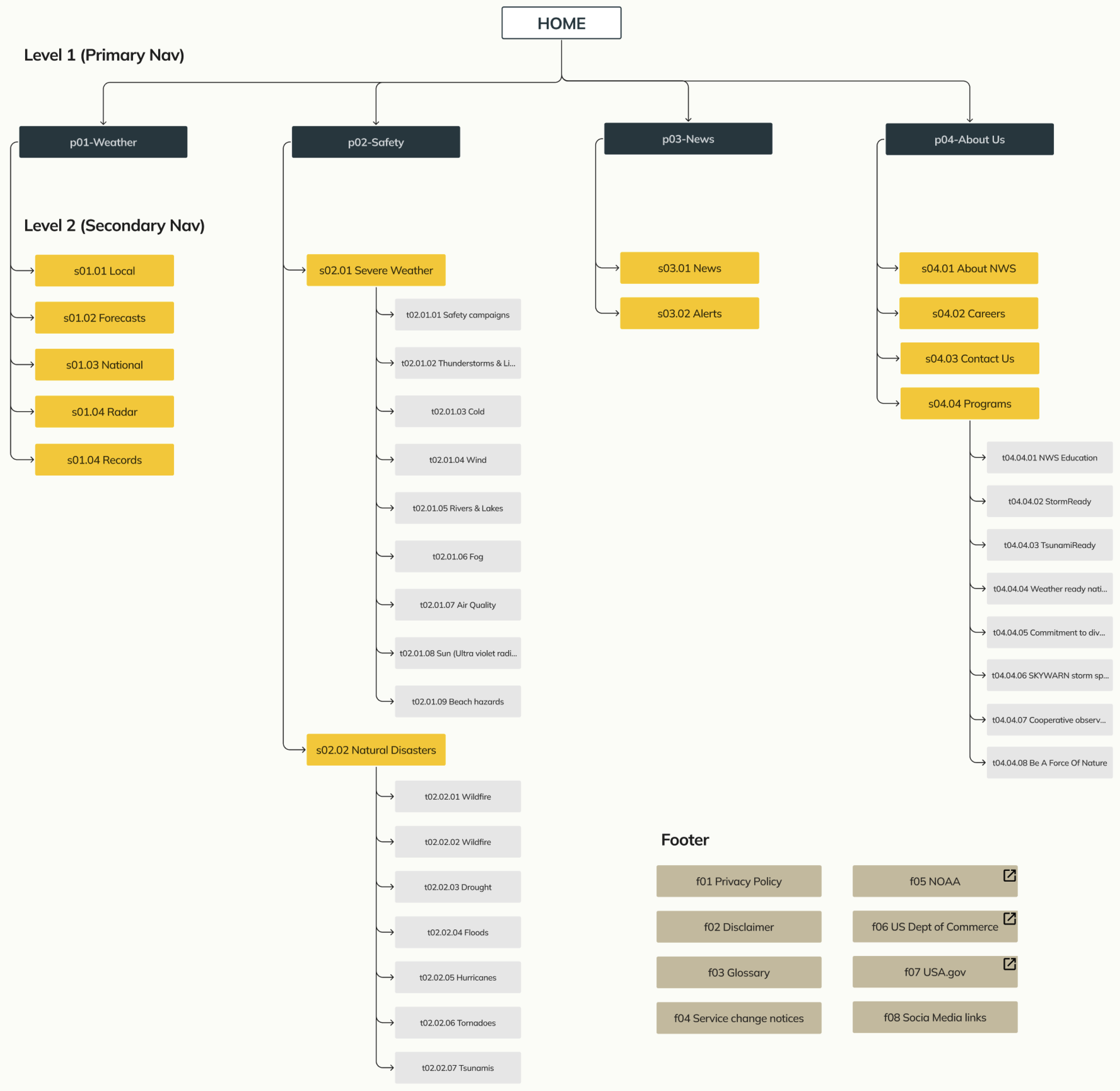
Site Map
The navigation was streamlined to four options, plus a home option, to simplify the process for users to find what they need. The design prioritized simplification and organization.
User Persona
The redesigned NWS website allows users to easily access it on their mobile devices while outside or on the go. It features a readable layout, large action items to reduce clicking errors, and an intuitive organization with important information prominently displayed.
Goals
Easily identify safety information for extreme weather conditions and situations to protect themselves and loved ones.
Quickly find current whether conditions on a mobile device while out in nature that are easily readable on a small screen.
Reduced clutter and text on each page for faster load times for important graphs, radar images etc on a mobile device.