
NSPKU Website Redesign Case Study
(National Society for Phenylketonuria)
Project overview
Our team redesigned the NSPKU website leading with empathy for those impacted by this disease and striving to improve overall site experience for all users. We embarked on this project ensuring to keep those impacted by PKU at the forefront of all redesigned features with the understanding that it can be a challenging new world for individuals looking to NSPKU.org for resources.
Team Members
Carina Daniluk, Emma Nalezny, Jill Ballandby, Josh Kohanek
Date
July 2024
The Problem
People affected by PKU have higher levels of stress and this gets amplified when attempting to find online solutions to their disease. The NSPKU website does not go far enough in its attempt to serve users.

research
The subject matter expert interviewees were pharmacists that work with PKU patients every day. They stressed that untreated PKU can affect patients’ cognitive abilities and processing times. This stressed the importance for a redesign that focused on accessibility.
Intuitive navigation, a less distracting color theme, user-controlled elements, simplified navigation, and text readability across the site were key to a successful redesign.
Objectives:
Get to know the user
Why are people visiting the NSPKU website?
Pain Points / Frustrations
Key Takeaways
Patient challenges (key to design)
Simple tasks can be difficult
May be easily agitated
Processing information may take extra time
Reasons for access (key to IA)
New research information on PKU
To learn/teach others about PKU
Dietary information
Community testimonials and stories
User Persona
Users like Kat here that visit NSPKU.org are typically affected by PKU in some aspect of their lives (a patient, a parent/family member or caregiver) They are looking to:
Educate themselves or others about PKU
Find reliable resources for dietary needs, provider or community support etc. to help them best care for themselves or a loved one
Goals
Keeping her child healthy and happy
Finding community support for PKU parent
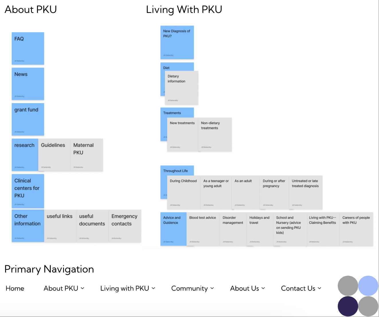
Card Sorting

Primary navigation was simplified to 5 options plus a home button (previously 9)
Removed redundant links/options
Prioritized Living with PKU and About PKU based on research about why users visit NSPKU.org
The navigation needed to be rearranged via card sorting so that “Living with PKU” and “About PKU” would be less overwhelming and more intuitive.
Concepts & Wireframes
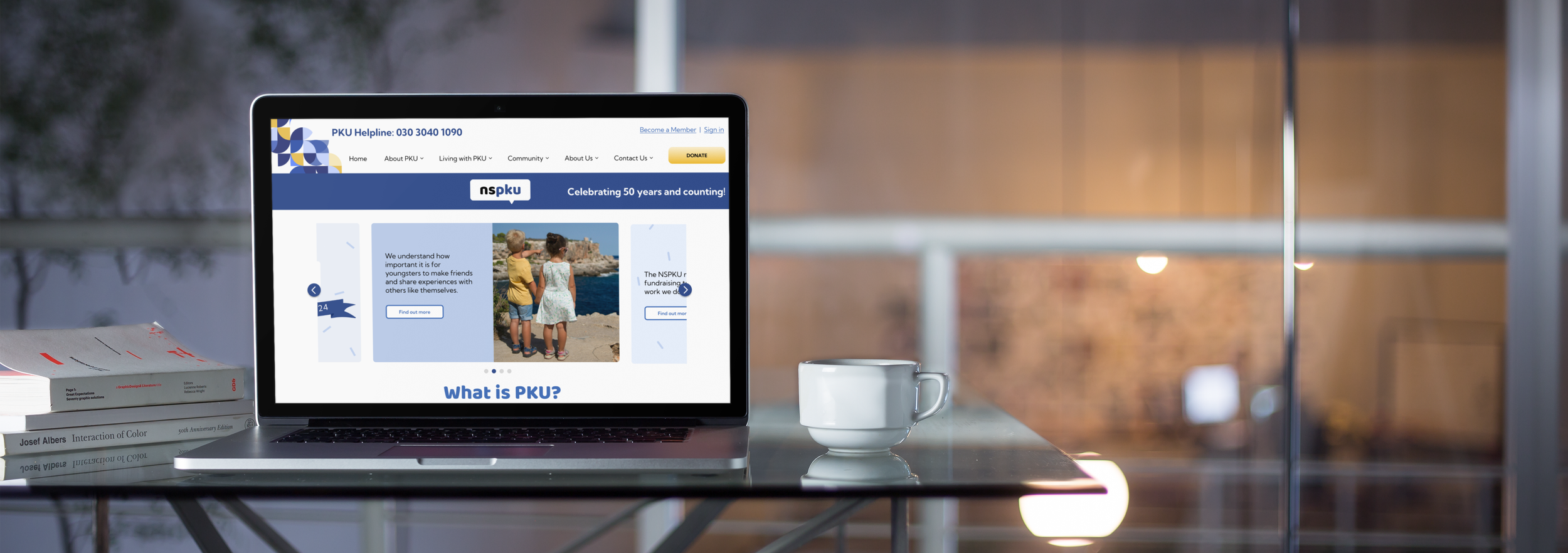
In building the homepage wireframes, the design was inspired somewhat by the original site with some key differences. The definition of PKU was placed above the fold to fulfill the user’s goal of teaching newcomers when visiting the site, and a news section was added to keep returning visitors up to date.
TESTING & Prototyping
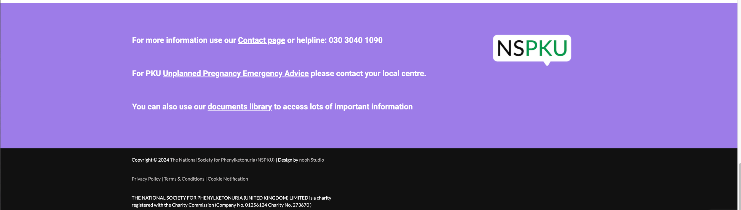
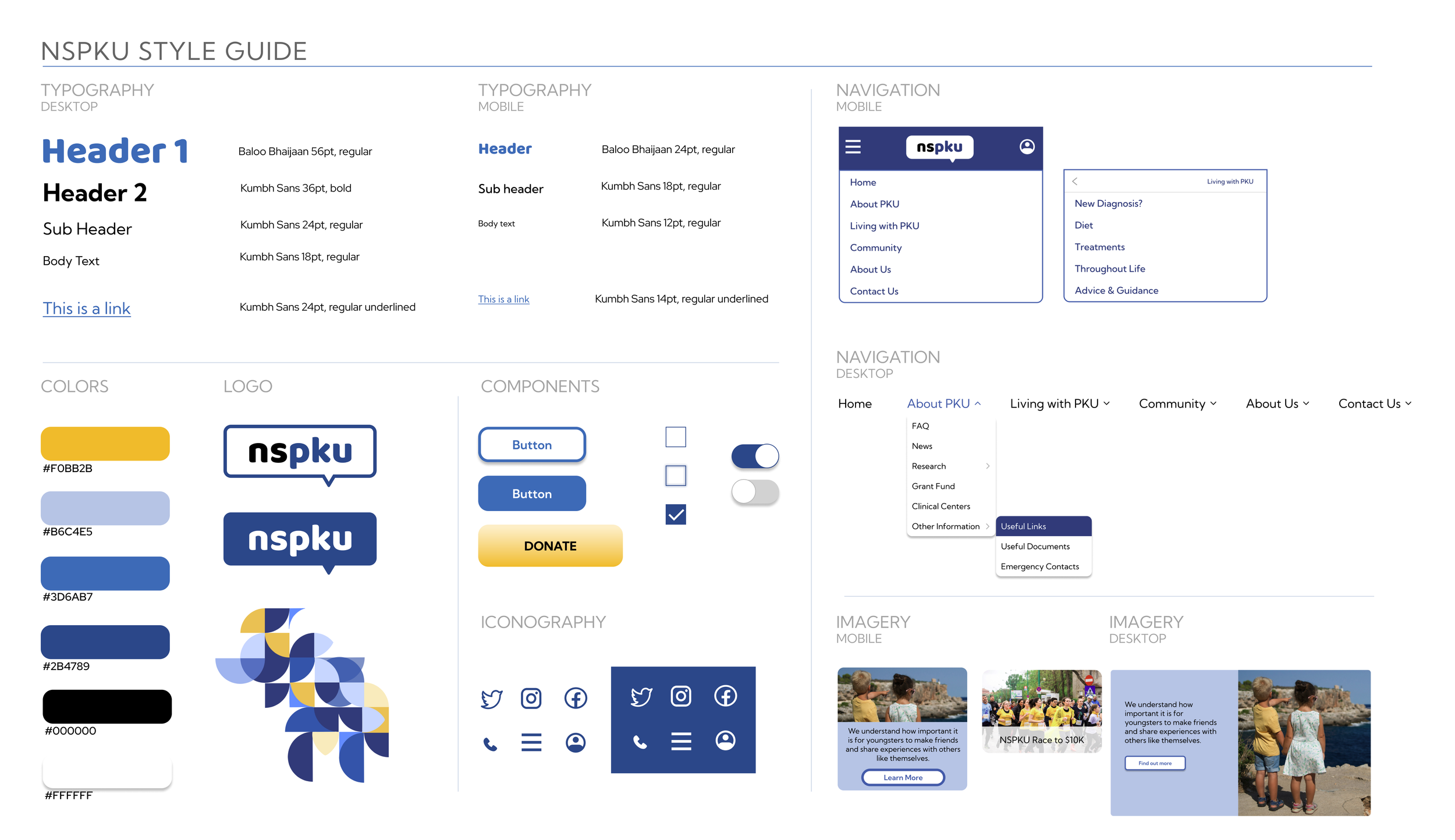
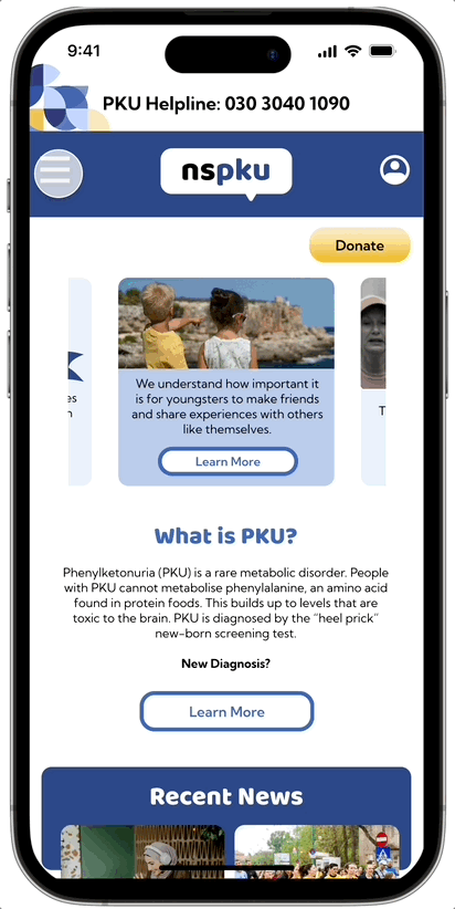
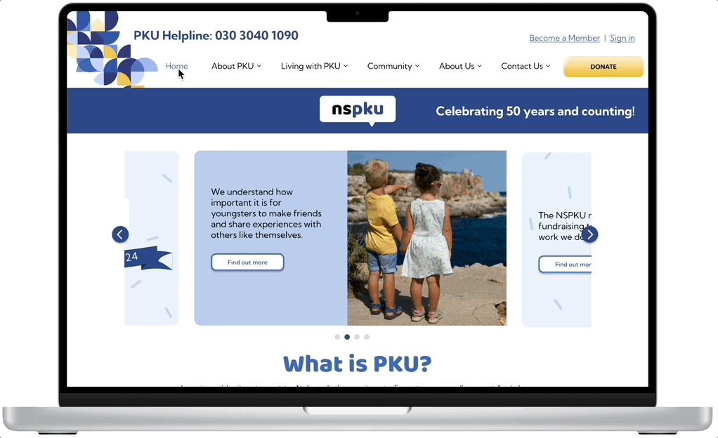
After testing and iterating the design, it was time to make the final version. The image carousel was very important in the final design. The original website had the carousel move on its own, which was not conducive to the research gathered about user processing times. The choice was obvious that it needed to be user-controlled to lessen stress levels and anxiety when trying to read. Breadcrumbs were added so that the user knew exactly where they were on the website, and the help line was moved to the very top of the page for easy access.
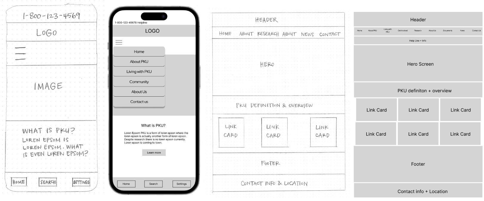
The color scheme was updated to a blue and white to symbolize healthcare and keep the site clean and easy to navigate. Pops of yellow were added for call to actions and highlights to keep true to some of the original site and bring in some originality. It was important that the colors passed not only AA color accessibility testing, but AAAa s well.
A/B Testing
Desktop
Test 1: The combination of white and blue header barely won out over the solid blue. They liked that the graphic in the corner looked against the white background
Test 2: Users overwhelmingly liked the navigation bar above the header with the logo.
Test 3: Users overwhelmingly liked the larger font for headlines as it was easier to read and easier to define the next section on the site.
Test 4: Users overwhelmingly liked the blue box headline with white text as it separated the section and they liked the contrast.
User test notes:
Much more relaxing to look at compared to the original website. They liked the color scheme
Mobile
Test 1: Users liked the variety of the blue/white header, which also matches the website design.
Test 2: Users liked the profile icon better than the words to log in. They did not feel like it needed to be that prominent and the icon is recognizable enough if they need to access it.
Test 3: Users liked the left aligned menu for easier scalability
User notes:
The donate button is too big. It makes the user think that is all the website is for and makes them feel guilty if they don’t donate.Reduced size and moved to the right.
The navigation is large and not accurate. Changed to just the black bar.
Add a back option for the navigation so they can get back to the secondary or primary options without starting over
Widened the menu to fill the width of the page to make it clear that they are in the menu and doesn’t mix with the website graphics/words.
Conclusion
One significant challenge was to gain a deeper understanding of PKU and how this condition affects users. In turn, this influenced our choices as UX/UI designers. Putting specific user needs before our own aesthetic preferences taught unique and worthwhile lessons.
We are also learning to balance both user and stakeholder needs. Our initial “donate” button was large and served a purpose for raising money. Ultimately, users felt it was misrepresentative of the website’s primary objective, so we reduced its size. This was an unexpected find for the team.
Redesigning a tool intended for medical use was incredibly motivating. This project provided a profound sense of purpose and significantly heightened the importance of the work.